
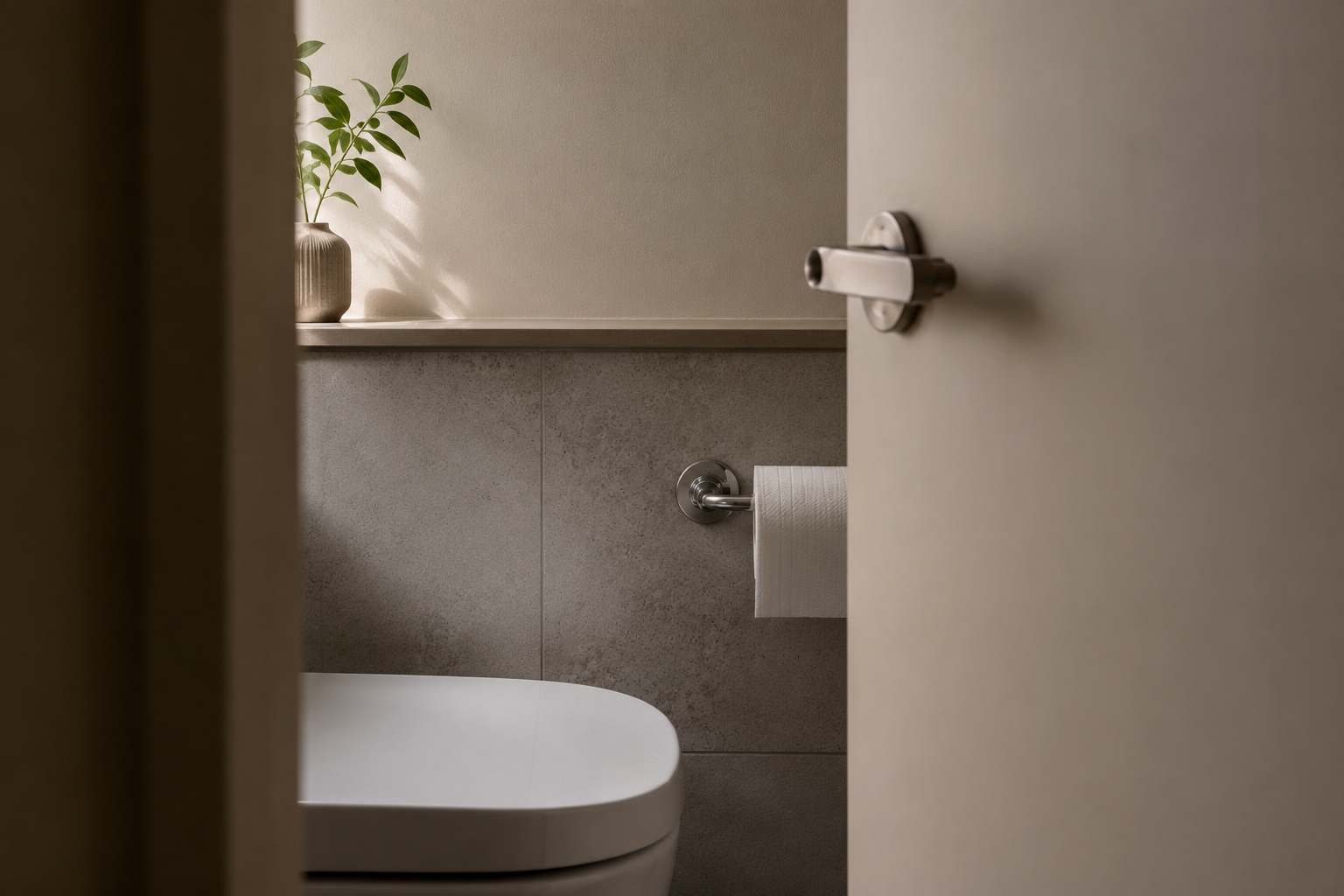
I love my bathroom renovation. I hate the toilet roll holder.
Not because it’s ugly. Not because it was installed badly. But because it is simultaneously slightly too close to the wall, and slightly too close to me.
Which means a fresh toilet roll only just fits…
while also requiring an unexpectedly intimate relationship with the gunmetal armature every time you reach for it.
And the truly devastating part is I have already had it moved once. So now it will taunt me forever.
Because there is a very specific category of social embarrassment where you simply cannot ask somebody to correct the same thing twice.
Like asking someone to repeat their name more than once.
After that point you are destined to spend the rest of your relationship avoiding the use of their name entirely.
And that is now my relationship with this toilet roll holder.
We coexist politely. Neither of us mentions the tension.
But every day it whispers “This is the correct position.”
And every day my knee replies “I fundamentally disagree.”
Which, honestly, feels like an unusually perfect metaphor for modern design.
So much of contemporary life consists of things that technically work while subtly punishing actual human use.
Taps that splash everywhere.
Airport seating with nowhere to place a bag.
Apartment kitchens designed for photographs rather than cooking.
Power outlets accessible only to contortionists.
“Minimalist” interfaces requiring seventeen interactions.
The chair is almost comfortable.
The shelf is almost reachable.
The app is almost intuitive.
The footpath is almost wide enough.
Everything is optimised for ideal conditions:
ideal bodies,
ideal behaviour,
ideal dimensions,
ideal use.
But human beings live slightly outside specification.
We carry bags.
We stand awkwardly.
We use kitchens while tired.
We replace toilet rolls one-handed.
We exist in physical space with knees and elbows and habits and margins.
Good design accommodates that reality. Bad design treats it as user error.
Anyway.
Four-ply is excessive.